Cartography How to – Trees! (Part 3)

By Jonah Adkins, GISP

Part Three: Symbolizing Vegetation Data

Using the samples of vegetation in maps from part one, and the newly gathered and created data from part two, we can now display the data within the map using symbology. Part three will focus on using multiple versions of the vegetation to create a pleasing look for your map.

In this example, the map is using a background color (tan) for the land and a transparent hillshade on top of that. There are two background vegetation layers you can choose to add; vegetation polygon areas or the Land Cover raster from part two. If using the Land Cover raster, create a unique value renderer using the classes 41, 42, and 43, under the symbology tab, to show only the vegetation classes. For this example, generalized vegetation polygons will be used, and in either case, try “Moss Green” for the color (RGB: 114 137 68). This darker green color will go above the background land layer and will be muted by the transparent hillshade layer above it.

Next, add the point layer created in part two. Navigate to the layer properties, symbology tab, and select a unique value renderer based off of the random value numeric field. Creating separate tree point symbols will give the appearance of a forested area on your map. For this example, two tree symbols were created using character marker symbols 110 and 113 from the “ESRI Enviro Hazard Analysis” symbol set.

Character marker symbology properties

Character marker symbology properties

Symbol 110 is using a light olive color (RGB: 173 185 83) at size 8, and symbol 113 is using a dark olive color (RGB: 133 149 52) at size 6. Both symbols have a shadow effect created by duplicating the symbol, and assigning an offset (x = 1, y = -1) using “Gray 50%” as the color. The shadow combined with the differing sizes and colors provide great contrast for the trees and create a nice pop effect on the map.

By putting together all of the information from this how-to, you can create a unique and eye-catching vegetation layer for your map. Combining or modifying past representations from part one with new techniques from part two and three should provide you with a solid base for creating a style customized to the story of your map. Included below are some more variations of the same techniques described above being used in different ways.


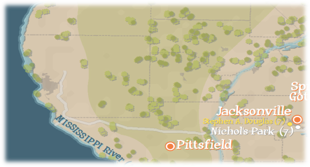
Example of tree points - "The Geography of Illinoise" (excerpt) Jonah Adkins, 2012 (c)

Example of tree points – “The Geography of Illinoise” (excerpt) Jonah Adkins, 2012 (c)

The above image is an excerpt from the sample data I used for this instruction. Of course, this is just one way to represent vegetation, and with cartography there are always many ways to accomplish the same goal.

Example of tree points - "The World Famous Jungle Cruise" (excerpt) Jonah Adkins, 2012 (c)

Example of tree points – “The World Famous Jungle Cruise” (excerpt) Jonah Adkins, 2012 (c)

The above example uses three varying sizes and one color of tree symbol from the “ESRI US Forestry” character marker symbol set. The background vegetation is solid color symbology from the polygon layer.

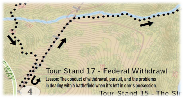
Example of tree points - "Wilson's Creek Battlefield Tour" (excerpt) Jonah Adkins, 2012 (c)

Example of tree points – “Wilson’s Creek Battlefield Tour” (excerpt) Jonah Adkins, 2012 (c)

The above example uses the Land Cover raster as a transparent background. The tree symbols are three varying sizes and types, but they use hollow architectural style symbols from the “ESRI US Forestry” character marker symbol set vice filled symbols.

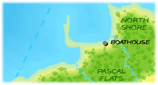
Example of tree points - "Greetings from the Island" (excerpt) Jonah Adkins, 2012 (c)

Example of tree points – “Greetings from the Island” (excerpt) Jonah Adkins, 2012 (c)

The above example uses three varying sizes and one color of tree stamp style symbol from the “ESRI US Forestry” character marker symbol set. The background vegetation is solid color symbology from the polygon layer.

Questions and Comments can be directed towards the author of this article Jonah Adkins.


Setting up your development environment for Python and ArcGIS Desktop

By: Christopher Fricke

Setup Aptana

  1. Download Aptana and Install <http://www.aptana.com/>
  2. Open up Aptana

    Pic1

  3. Configure your workspace.  This will be where all of your project files will be stored.  I recommend throwing this in C:\Users\YourUsername\Source.  You can hit that checkbox so that it doesn’t ask you ever again.

    Pic2

Configure Python

  1. Once Aptana is open, you will need to specify your Python Interpreter.  This process allows you to specify  the version of Python that ships with the ArcGIS for Desktop or ArcGIS for Server installed on your machine.  [Note: ArcGIS for Server ships with x64 bit python.  You can add in both 32 and 64 bit interpreters if you have desktop and server on the same machine.]
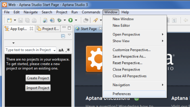
  2. First open up Aptana preferences

    Pic3

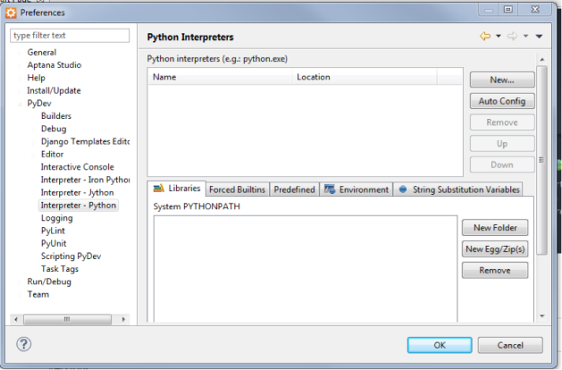
  3. Open PyDev / Interpreter – Python

    Pic4

  4. Click the button labeled New…
  5. Give the interpreter a unique name.   I am labeling it ArcGIS Python 2.7 x32, because this is for the default python location for ArcGIS for Desktop 10.1.  If I were doing server, I would label it ArcGIS Python 2.7 x64.
  6. Also, add in the path to the python executable:
    – The default path for 10.1 desktop is C:\Python27\ArcGIS10.1\python.exe
    – The default path for 10.1 server is C:\Python27\ArcGISx6410.1\python.exe
    – The default path for 10.0 is C:\Python26\ArcGIS10.0\python.exe

    Pic5

  7. Click OK a few times.
  8. The python interpreter is now ready for action.

Your first project!

  1. First select the button labeled “Create Project” in the right hand window of Aptana.

    Pic6

  2. Select PyDev / PyDev Project

    Pic7

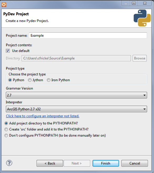
  3. Give your project a cool name, like “Example” and make sure to specify the Python interpreter you created in the previous section.  Click Finish.

    Pic8

  4. Create a python package by right clicking on your folder and selecting New / PyDev Package.  This is the folder you will be creating all of your code in.  Name it something clever like, example.  A python module is a folder with a __init__.py file inside.  This allows your python files you create as a module rather than just one off scripts.
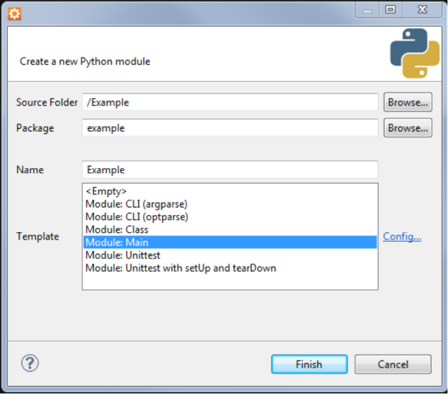
  5. Now right click on the example folder and create a new python file by selecting New / PyDev Module.  Give it a fun name like “Example” and select the “Module: Main” template.  Finally click finish.
    – More advanced users can play around with the other templates.  For right now the main one should work perfectly for our needs.

    Pic9

  6. The following code prints out the name for all of the toolboxes available in ArcMap.  Type it in to see if your Python Environment is setup and ready to roll in Aptana.

    import arcpy
    if __name__ == ‘__main__’:
    toolboxes = arcpy.ListToolboxes() # Query for a list of toolboxes
    for toolbox in toolboxes: # Loop through the toolboxes
    print toolbox # And Print the name out

  7. Click the play button in the main toolbar on the top of the screen.

    Pic10

  8. Once you hit play, toolbox names should start popping up in the console section of Aptana.

    Pic11

  9. You are ready for lift off!

Cartography How to – Trees! (Part 2)

By Jonah Adkins, GISP

Part Two: Gathering and Preparing Vegetation Data

There are several types of vegetation data available to most map creators. These can range from highly desirable tree inventory points and remotely sensed polygonal areas from local high resolution imagery to varying scales of polygonal data digitized from state or national imagery sets. This section will focus on gathering free vegetation layers from national sources and preparing it for symbolization in a map.

If you have existing high resolution imagery, Esri has published a great instruction on creating vegetation polygons from 4-Band imagery. You can also use standard 3-Band imagery, but the results will be less accurate.

Within the United States and some outlying areas, the most recognized place for free vegetation data is the National Land Cover Database[1]. This data is available at 30 meter resolution for the years 1992, 2001, and most recently, 2006. The two easiest and interactive methods to get this data for a specific area are through either the USGS National Map or the NRCS Geospatial Data Gateway.

For both sources, the data is delivered in a raster format and is classified into 20 themes ranging from urban and water to crop and vegetation, among others. The classes you will want to isolate are 41, 42, and 43.

Below are the class definitions from the USGS site:[2]

  • 41. Deciduous Forest – Areas dominated by trees where 75 percent or more of the tree species shed foliage simultaneously in response to seasonal change.
  • 42. Evergreen Forest – Areas dominated by trees where 75 percent or more of the tree species `maintain their leaves all year. Canopy is never without green foliage.
  • 43. Mixed Forest – Areas dominated by trees where neither deciduous nor evergreen species represent more than 75 percent of the cover present.
Fig1

Land Cover data with vegetation classes selected and the raster to polygon tool.


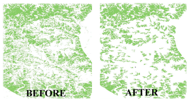
To convert the vegetation data, select the values 41, 42, and 43 from the raster attribute table within the Land Cover raster. The Raster to Polygon tool (ArcToolbox, Conversion Tools, From Raster) will convert the selected values to a polygon layer. There will be many parts with an area of a few cells or less, so depending on your use of the data, you will want to delete these. For this example, the output map scale is larger than 1:150,000; therefore the majority of small areas will be deleted. Use the Identify tool on several polygons to determine a threshold value. Perform an attribute query on the “shape.area” field using your desired value, and then delete the selected features in an Edit Session.

Before and after views of deleting small areas from vegetation polygons.

Before and after views of deleting small areas from vegetation polygons.


With a final version of the polygon layer, use the Randomize Points Tool (Data Management Tools > Feature Class > Create Random Points) to create a layer of randomly generated points. It should be noted that this method does not represent actual tree points, but creates points located within the polygon boundaries. With the tool open, specify an output location, a name for the new point feature class, and the constraining feature class; this will be polygon layer created in the previous steps. Number of Points allows you to specify how many random points you would like in each polygon, and Minimum Allowed Distance picks the minimum spacing between the random points in the polygon. For the example shown, Number of points was set to 50, and 500 meters was the Minimum Allowed Distance used. Further tweaking of these two inputs will be needed depending on your use.

 create random points tool (right) and the output result (left)

create random points tool (right) and the output result (left)

Finally, to allow you to create unique symbology in Part three, assign random values to the newly created random points. With the attribute table open, add a numeric field using the attribute table menu button, and select “Add Field”. Right click on the new field and open the Field Calculator. Enter either of the following code samples depending on the language you are using to create a random integer between 0 and 2:

  • Python – arcgis.rand(“Integer 0 2”)
  • VB Script – Int ( 2 )*Rnd

There are several other methods to refine the polygon data; Aggregate Polygons will merge adjacent polygons at a specified distance, and the Simplify and Smooth Polygon tools will improve shape of polygon features. Part three will focus on bringing these layers into your map and choosing the most cartographically pleasing method for display.


CNIC Navy Energy Program and NSGEM

Recently the Navy Shore Geospatial Energy Module went through its fourth successful promotion release in the GeoReadiness Explorer Production environment, and the hype is heating up about it, so I thought I would give everyone a little background on the program and what NSGEM can do….

Commander, Navy Installation Command (CNIC) instated the CNIC Energy Program in order to provide guidance, policy, and tools for implementing mandated energy reduction and sustainability practices.  The main goals of the program (as outlined in OPNAV policy OPNAVINST 4100.5E) are:

  • 50% reduction in energy consumption by 2020.
  • 50% renewable energy source consumption by 2020.
  • 50% net-zero participation by 2020.

In order to meet these goals, CNIC adopted a Facility Energy Strategy that includes: reducing energy demands (facilities and building practices using less energy consumption), expanding energy supplies (adopting alternative/renewable sources), enhancing energy security (sustainable energy usage), and advancing new technologies (installing smart meters on each building, using GIS to leverage and provide metrics from available consumption information, etc). Ms. Sandrine Schultz, the CNIC Energy Program Manager, had a vision of an overarching geospatial tool that provides the Navy with centralized information access for tracking, measuring, and planning such practices. Up to this point, there was no effective way of visualizing and displaying the important tabular data in the business systems that tracked energy usage. GISi was consulted with reviewing current capabilities and building a suite of tools upon the GeoReadiness Explorer application already in place and maintained by NAVFAC (Naval Facilities and Engineering Command), and so began the birth of NSGEM.

As the NSGEM Team started development, the data sources were gathered and compared. The initial goals package (created by Booz Allen Hamilton) provided benchmark scores for energy consumption and set reduction numbers in place, which in turn established the baseline metrics CNIC needed to go forth in their mission. A Gap Analysis was performed initially to identify where disparities lied between the main data sources: iNFADS – the Navy’s real property database, CIRCUITS – the utility allocation and billing system, and the GeoReadiness (GRX) CIP – the worldwide geospatial data. This effort pinpointed further needs and issues, some could be resolved and some still in flux, and generated a Data Quality Score that is shown in the current interface. Gap Analysis layers are available as well, to highlight the specific facilities that have these particular issues.

They next proceeded to the development of the ETL processes.  They were built to extract and transform the data from the business systems into spatial data that is published through ArcGIS Server as a map service. The published map service contains three layers depicting energy consumption and reduction efforts at the region, installation, and facility level.  The GRX map publishing process is done via an ASP.NET web application called Map Publisher.  The GRX Map Viewer is the front end of the GRX system. The Map Viewer displays the maps, layers, bookmarks, and other common functionality you would expect from a map viewer.  Upon startup the GRX Map Viewer loads the appropriate map services, layers, tools, data and other configuration as defined by the map viewer instance created with Map Publisher.  While the bulk of the NSGEM functionality revolves around the dashboard and the various tables and charts, it does leverage existing Map Viewer functionality to display and navigate to spatial data.

rembNSGEM was promoted into Production on the NAVFAC/RSIMS Portal on November 12, 2012.     Upon release of the tool, it became apparent that there are many folks throughout the Navy that have a stake in its functionality and future.  The various echelons have different reporting and analysis needs.  One measure taken to support Headquarters with program oversight was to create the Regional Energy Map Books, which started with automating a map product.   These automated processes provide high-level quality cartographic outputs for leadership at CNIC and NAVFAC to be able to view statistics and consumption information in PDF format for which the user(s) do not have to access a separate application.  They are stored on CNIC’s own Sharepoint site, and will be updated on a quarterly basis for new consumption data.  Another measure that was initiated was user outreach; a variety of individuals joined in the initial release training sessions, and new requirements fallonstemmed from the awareness.  The power users gave suggestions, data is being refined, and functionality developed.

The primary function of NSGEM and the REMB’s is really higher awareness and easier accessibility of energy consumption information. It provides the Energy Program with a one-stop shop for viewing and using consumption data. CNIC and NAVFAC now have the ability to reveal the story of data that has been isolated in a business system and to smoothly and dynamically transition across all necessary temporal (many years), spatial (zoom in/zoom out), and organizational (world, region, installation, and facility) scales. Development is currently underway to leverage and view specific billing information such as commodity and bill payer breakdowns. The tool will be able to not only show where energy issues are happening, but who may benefit from implementing new measures.

NSGEM is geospatially enabling the Energy Program with tools to track and measure with standardized methodologies their progress to reduction goals, pinpoint specific areas for improvements or restorations, view new and alternative energy sources geospatially, create sustainable practice methods, and increase overall energy usage awareness.

Tim Calkins Hired to Lead GISi’s Financial Services Team

Geographic Information Services, Inc. (GISi) is excited to announce the hiring of Tim Calkins for the position of Financial Services Market Manager.  Tim joins GISi from Bank of America where he served as Vice President of Business Intelligence Development. While at Bank of America, Tim managed Risk Reporting and Business Analytics for the Global Risk Management Group.  He provided thought leadership regarding Business Intelligence and risk management best practices and approach methods.  Tim brings solid business, technical and operational experience to GISi where he will work with clients in the financial industry to solve business problems using location technology and GIS services.

“We are excited to have Tim joining our team,” said Keith King, General Manager of GISi’s Private Sector Group.  “Tim brings a wealth of financial services domain experience and business analytics knowledge to GISi.  He will take the lead in helping our banking and insurance clients improve their operations and their bottom line.”

Lee Lichlyter, CEO of GISi goes on to say, “The addition of Tim further illustrates our confidence in the power of location technology as well as the high return on investment our services offer to our private and public sector clients.”

About GISi

Geographic Information Services, Inc. (GISi) is an award-winning location based technology and professional services firm headquartered in Birmingham, Ala., with offices throughout the United States. Since 1991 our team of GIS professionals has been using Geographic Information Systems to solve staffing, technology, and business needs in markets ranging from Federal, State and Local Governments to some of the largest public and privately-held companies in the world.

Contact
Jeff Vreeland, Marketing Manager
Telephone: 205-941-0442 x 224
Email: jvreeland@gisinc.com